
Close
Picture this: You walk into a canal house apartment in Amsterdam’s Jordaan district. The space feels open and airy. Light bounces off the floors. Your eye travels smoothly from the entrance through to the living room without stopping.
Then you check the floor plan. Wait. This apartment is only 68 square meters? You could swear it felt twice that size.
The designer knows exactly what she did. She replaced the old 30×30cm terracotta tiles with 60×120cm porcelain slabs. Same apartment. Same walls. A completely different feeling.

Here’s the thing about Dutch urban living. You can’t knock down walls in a historic building. You can’t add square meters when you’re sandwiched between neighbors on both sides. The footprint is what it is.
But you can absolutely change how that space feels. And in the Netherlands where apartments average around 49 -75 square meters and canal houses measure barely 3 meters wide, making space feel bigger isn’t a luxury. It’s essential.
Large format tiles have become the secret weapon for Dutch designers working with compact interiors. Not because they’re trendy. Because they actually work.
Let’s talk about what makes Netherlands housing unique.
Dutch apartments in cities like Amsterdam, Rotterdam and Utrecht typically measure 70-90 square meters. That’s about 20-30% smaller than comparable apartments in other Western European capitals.
This isn’t poor planning. It’s reality. The Netherlands is one of Europe’s most densely populated countries. Amsterdam alone packs approximately 5,100 people per square kilometer. When you’re that dense, space becomes precious.
Historic canal houses add another layer of challenge. They were built narrow because property taxes used to be based on canal frontage width. So builders went tall and deep instead of wide. Today that means charming but cramped rooms where every design choice matters.
The Netherlands sits at about 52 degrees north. In December you might only see 7 or 8 hours of daylight. The sun never gets particularly high even in summer.
Dutch architecture adapted centuries ago with those big canal-facing windows. Interior design has to work with this reality. You need materials that grab whatever light is available and bounce it around the room. Dark, light-absorbing surfaces make spaces feel smaller and gloomier.
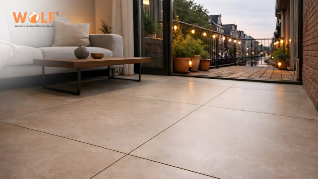
This is where large format tiles really shine. More continuous surface area means better light reflection. Fewer grout lines mean fewer shadows interrupting that light flow.
Walk through any Dutch home and you’ll notice something. Clean lines. Minimal clutter. Function and beauty working together instead of fighting each other.
This isn’t just design philosophy. It’s a practical adaptation to limited space. When you can’t have excess, everything needs to earn its place.
Large format tiles fit perfectly into this mindset. They’re beautiful without being fussy. They create visual calm instead of chaos. They make small spaces work harder without working harder yourself.
Here’s what happens when you look at a tiled floor.
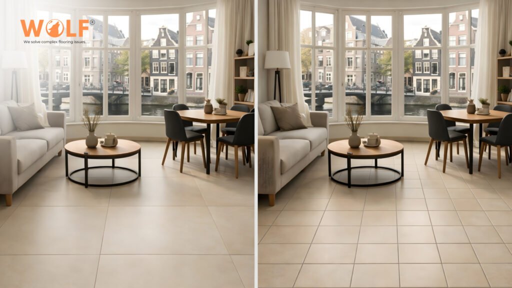
Your brain processes each grout line as a boundary. A little visual stop sign. With standard 30×30cm tiles, you get grout lines every 30 centimeters going both directions.
Do the math on a typical Amsterdam living room (let’s say 4 meters by 5 meters). That’s about 13 grout lines running one way and 16 running the other. Your eye hits interruptions constantly. The room reads as chopped up into tiny squares.
Switch to 60×120cm tiles and suddenly you only have about 3 lines one way and 4 the other. Your eye travels across smooth, continuous surfaces. The same room reads as open and flowing.
The actual square footage hasn’t changed. But the feeling? Totally different.
In that same 4×5 meter room, standard tiles create approximately 40 linear meters of visible grout lines. Large format tiles drop that to roughly 10 linear meters. You’re cutting visual interruption by 75%.
Think about what that means. Three quarters fewer stops for your eye. Three quarters more continuous surface. Three quarters more calm visual flow.
Dutch apartments often have open floor plans. The kitchen flows into the living room. The hallway opens to the dining area. There aren’t many walls to work with.
When you run the same large tile from one space into another with minimal grout interruption, something interesting happens. Your brain stops seeing separate rooms and starts seeing one large, connected area.
This works especially well in compact Dutch homes where you can’t afford to waste any psychological space. Make every square meter count by making it feel connected to the next square meter.
A more continuous tile surface means more even light reflection. Grout joints create tiny shadows. With fewer joints you get smoother light distribution across the floor.
In the Netherlands where you’re working with limited natural light to begin with, this matters. A light colored large format tile in matte or semi-polished finish can make a north-facing room feel noticeably brighter than the same color in small tiles.
Not all large format tiles work the same in compact Dutch homes. Let’s break down what actually makes sense.
For most apartments and canal houses in the Netherlands, this format hits the perfect balance.
A Rotterdam designer working on Katendrecht renovations puts it simply. This format handles typical Dutch room widths (3 to 3.5 meters) with just 2 or 3 grout lines instead of 8 or 10. The visual difference is huge.
The square format works when you have more space to play with and want maximum impact with minimal grout lines.
Tiles bigger than 120×120cm exist. But in Dutch contexts they create more problems than they solve.
You’ll struggle getting them into historic buildings. Many staircases and doorways simply won’t accommodate them. Older floor structures may need reinforcement. And honestly, in a 15 square meter room, a tile that’s 120×240cm can look weird instead of elegant.
Stick with formats designed for the realities of Dutch housing. The 60×120cm and 120×120cm sizes give you all the visual benefits without the logistical nightmares.
Take a rectangular tile like 60×120cm. You can install it two ways.
Horizontal (long side going across the room): Makes narrow rooms feel wider. Perfect for canal houses where width is your limiting dimension. Creates a calm, grounded feeling.
Vertical (long side going lengthwise): Makes rooms feel longer and pulls your eye deeper into the space. Works well in square rooms that need more movement. Can make narrow hallways feel less tunnel-like.
Narrow living rooms get horizontal installation. Square bedrooms get vertical. Same tile, different feelings.
Go light and neutral: Warm beiges and light greys reflect 60-70% of available light back into your room. Off-white and cream tones suit the minimalist Dutch aesthetic while making spaces feel bigger and brighter.
Natural stone looks to work particularly well. Think limestone or travertine effects. You get visual interest without heaviness.
Skip these: Very dark tiles in rooms with limited windows. You’ll make the space feel smaller and gloomier. High gloss finishes that create glare (Dutch daylight is soft, not intense, so matte or semi-polished works better). Busy patterns that fight against the visual simplicity you’re trying to create.
Want to know a designer secret? Use the same tile throughout all your connected spaces.
When your eye follows one continuous surface from the entrance hall through the living room into the kitchen, the entire apartment reads as one big space. No visual breaks. No stopping points. Just flow.
This works incredibly well in compact Dutch apartments. A 65 square meter place can feel like 90 when you create this kind of visual continuity.
A 75 square meter canal house apartment used 60×120cm light grey porcelain throughout. The continuous surface from the narrow entry hallway through to the living room makes the width feel nearly double. Large canal-facing windows provide natural light that the tiles reflect beautifully. The owner says visitors consistently guess the apartment is at least 90 square meters.
A 95 square meter loft in Katendrecht installed 120×120cm tiles in warm beige. The industrial-sized format suits the loft aesthetic. The light color softens concrete and steel surroundings. Minimal grout lines keep the open plan feeling genuinely open instead of segmented.
A new building near Utrecht Centraal (68 square meters) used 60×120cm tiles in living areas and continued the same tile onto bathroom and kitchen walls. The material consistency throughout this compact space creates remarkable visual unity. Every area feels part of a larger whole instead of a separate small room.
Large format tiles must be precisely sized (rectified edges) to achieve those narrow grout lines. If tiles vary by more than 1-2mm, installation becomes a nightmare.
Any warping or bowing shows dramatically in large slabs. Professional grade tiles maintain flatness within tight tolerances.
Variations cause lippage (edges at different heights). Quality manufacturers control thickness to within 0.5mm.
With large tiles, each individual tile is more visually prominent. Batch to batch color consistency matters more than with small tiles where variations average out across many pieces.
Wolf Group India manufactures large format porcelain using Italian technology that delivers the precision Dutch installations require. Our tiles come in formats that work for Netherlands compact homes:
All formats feature rectified edges and consistent thickness. Water absorption stays below 0.5%, which suits Dutch climate conditions perfectly. Available in matte and semi-polished finishes with subtle natural stone aesthetics that align with minimalist Dutch interiors.
Two decades of manufacturing for demanding European markets taught us what Netherlands designers need. Precision dimensions for narrow grout lines. Consistent quality for visual continuity. Reliable supply for project timelines.
Technical specifications and dealer information at wolfporcelaintiles.com or info@wolfgroupindia.com.
60×120cm tiles hit the sweet spot for most Dutch apartments. They reduce grout lines by about 75% compared to standard 30×30cm tiles. This makes compact spaces feel more open without creating installation headaches in typical Amsterdam, Rotterdam or Utrecht apartments.
Install the long dimension (120cm) horizontally across narrow canal house rooms to make them feel wider. For square rooms, try vertical installation to create depth. The direction you choose directly changes how spacious the room feels.
Large formats excel when you cannot physically expand space. Historic canal houses with fixed dimensions. Compact urban apartments under 100 square meters. Open plan areas where visual flow matters. Basically anywhere making perceived space bigger is more realistic than making actual space bigger.
Skip formats bigger than 120×120cm in rooms under 15 square meters. They look disproportionate. Also reconsider large formats for upper floors in old canal houses if your stairwell is too narrow or floor structure needs reinforcement.
Dutch buildings vary wildly. Wooden floors in canal houses need different prep than concrete in modern builds. Large format installation requires preventing lippage (uneven edges) and working with tight tolerances. Poor installation destroys the visual benefits completely.
Find installers with specific experience in slabs 60cm or larger. They need proper leveling equipment and a portfolio showing work in Dutch buildings like yours (canal house, apartment, new construction). Ask to see previous large format jobs and verify they understand your specific subfloor situation.